60 points from 10,000: how stream charts stay readable
7cubit Team
More in Engineering
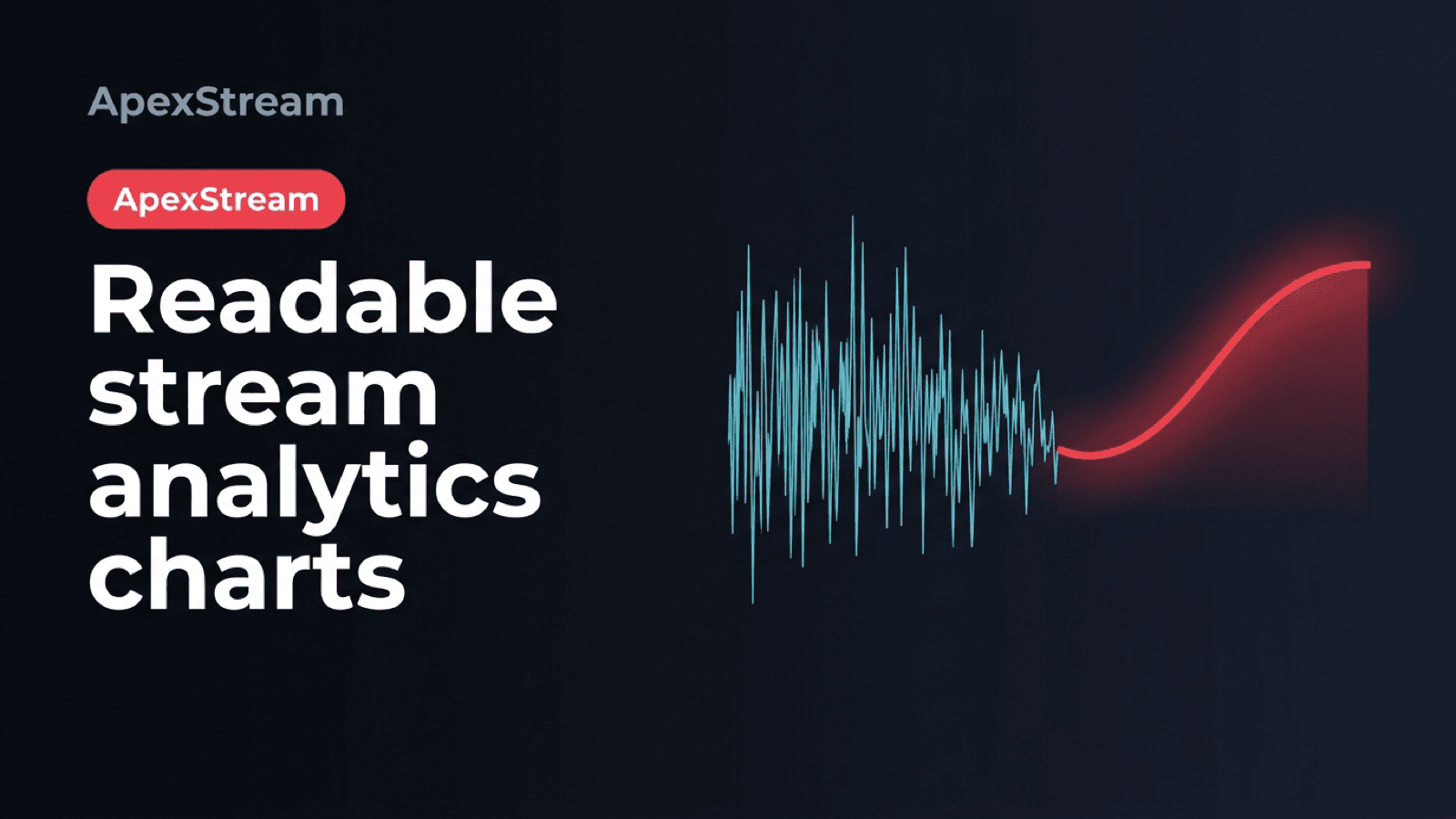
A long stream produces more samples than a browser chart can usefully draw. Viewer counts change by platform, and health measurements add bitrate, FPS, and dropped-frame rows. Plot every raw point and the chart becomes heavy and noisy. Average everything and the chart becomes calm in ways the show was not.
ApexStream serves at most 60 points per series using Largest Triangle Three Buckets, or LTTB. The goal is not to make the line look nice. It is to keep the turns that help you see when a destination dropped, a bitrate spiked, or a scene change caused trouble.
What the analytics request returns
The stream detail endpoint is GET /analytics/streams/:id/timeseries. Access is checked against the customer's StreamLog. Engagement data comes from the stream engagement log and includes YouTube, Facebook, and Twitch viewer fields plus chat message counts.
Health data—bitrate, FPS, and dropped frames—is available for Hobby and above. Free stays engagement-light. The response metadata reports both the raw point count and the served count, along with downsampledTo: 60, so the chart does not have to guess what it is displaying.
Why a simple average can hide the useful part
Imagine splitting a ten-minute window into equal buckets and drawing one average per bucket. A 30-second viewer cliff and a recovery can collapse into a harmless-looking middle value. A bitrate spike can disappear into the average of the surrounding seconds.
Taking every tenth point has a similar weakness. The result depends on where the sampling starts. Choose the wrong phase and you miss the spikes entirely.
LTTB preserves the shape rather than the average. It is a geometry method, not an AI guess, and it has a clear target: retain the points that form the important turns under a fixed display budget.
How LTTB chooses the 60
The first and last samples are kept. The interior samples are divided into buckets sized for the target count. For each bucket, a candidate is scored by the area of the triangle made from:
- the point selected from the previous bucket;
- the candidate point in the current bucket;
- the average point in the next bucket, which estimates where the line is heading.
The candidate with the largest area survives. A large triangle means a meaningful bend relative to the surrounding data. Flat stretches can be represented by fewer points while peaks, valleys, and abrupt changes remain visible.
Engagement uses total viewers—YouTube plus Facebook plus Twitch—as the selection signal, then carries the platform fields from the chosen timestamps. Health uses bitrate as the key signal so a bitrate problem is not hidden just because FPS stayed steady.
Why 60 is enough for the dashboard
This means the selected rows are shared across the fields shown together. A viewer-count line and its per-platform values refer to the same timestamps, rather than each metric being reduced independently and then visually compared at different moments.
Sixty points are enough to read a multi-hour Flight Log chart without asking a phone to download and draw thousands of rows. Short shows with 60 or fewer raw samples are returned as-is; a 12-minute stream does not get thinned for the sake of a fixed number.
The current path fetches the raw rows, converts timestamps to epoch milliseconds, and applies LTTB in memory. It yields to the event loop during longer work so opening an unusually large chart does not monopolize the API process. That keeps the existing database path workable while the served response stays small.
The reduction happens for display, not as a replacement for the underlying history. The raw point count in the response metadata tells you whether a 60-point line summarizes 60 samples or 10,000. If you need a precise event time, use the chart as a guide and inspect the related stream record rather than treating the nearest displayed point as a frame-perfect timestamp.
How to read the result
Believe a visible spike. LTTB is specifically trying to preserve the turns that averaging would erase. If a line looks flat, the data was flat at the resolution the chart can show; it was not automatically smoothed into calm.
LTTB only shapes the timeseries. Totals and demographics come from their own aggregates. The metadata tells you how much history sat underneath the curve.
A readable chart is a small view of a large history. The useful reduction keeps the moments where the shape changed.
Use totals to answer how much happened and the downsampled line to answer when the show changed. Those are different questions, so they need different handling.