Tickers: when to use them and when to leave them off
7cubit Team
More in Creator Guides
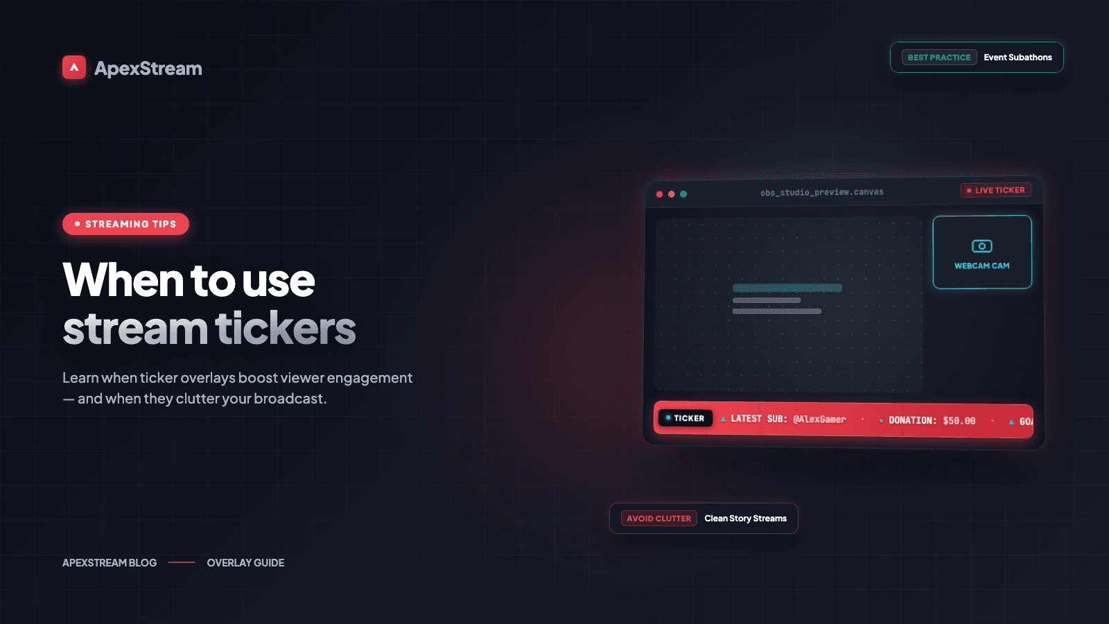
A ticker is useful when the viewer needs a reminder but does not need you to interrupt the conversation. It is also one of the easiest ways to make a screen feel busy. Before turning one on, decide what information deserves to keep moving at the bottom of the frame and whether the show benefits from a second visual demand.
Write one message per line
In Web Studio, treat each ticker line like a headline. One message per line is easier to scan, easier to edit, and less likely to become a paragraph that races past the viewer. “New episodes every Tuesday” works. A sentence that includes your schedule, store, social accounts, and a thank-you does not.
- Good: Questions? Add them to the chat.
- Better for a link reminder: Resources are in the description.
- Too much: Thanks for watching, please subscribe, follow all our accounts, visit the store, and remember the next show is Tuesday at 4 PM.
Use the ticker for information that can be understood without explanation: a topic, a short reminder, an event time, or a current call to action.
Choose a speed you can read
Web Studio gives you speed choices. Start with the slowest setting that still feels like motion, then watch the preview from a normal viewing distance. If you have to chase the words with your eyes, it is too fast. If a complete message takes so long that a viewer gives up, it is too slow.
Read the line aloud at a comfortable pace. The text should glide at roughly the speed you would say it, without making the viewer rush. Check it again on a smaller screen if your audience watches on mobile.
Keep the fixed bottom position clear
The ticker stays at the bottom of the frame, so plan that area before adding lower-thirds, comments, or captions. Two elements that are readable on their own can become a wall of competing text when stacked together. If you need both a ticker and a lower-third, preview them at the same time and decide which one has priority.
The same check matters for portrait output. A vertical frame has less horizontal room, so a line that looks short in landscape may wrap or feel crowded after the crop. Shorten the message before you make the type smaller.
When a clean frame is the better choice
Leave the ticker off during an emotional interview, a sensitive announcement, or a quiet conversation. A bright moving line can undercut the tone even when its words are harmless. The viewer should not have to choose between the speaker's expression and a promotional reminder.
Skip it for dense tutorials and screen shares too. The audience is already reading menus, diagrams, or code while listening to you explain them. Motion at the bottom adds another task without adding much value.
Think about the recording after the live show. If you use the Podcast Studio on Hobby or above to turn a stream recording into a draft audio episode, a visual ticker will not be present for podcast listeners. Avoid building a spoken explanation around text that only exists on the video.
Give the ticker a job
A ticker can reinforce a Live Commerce discount, keep the current topic visible during a long stream, or point viewers to an upcoming event. It should not exist simply because the control is available.
Before you go live, look at the preview for ten seconds without reading the message. Does your eye stay on the host or the main content? If the ticker keeps pulling your attention, your viewers will feel that too. Turn it off, shorten it, or slow it down. A clean screen is often the more professional production decision.
Give it an expiration point
Remove a reminder when it stops being true. A past event, finished discount, or old resource link makes a replay look careless. If the ticker is tied to one segment, turn it on for that segment and off when you move on. A short-lived message is easier to trust than a crawl that survives every scene.